Cascade Athletic Clubs | Landing Page – Case Study
Landing Page Design and Website Copy
Background
I’ve been a long-time member of my local Cascade Athletic Clubs (CAC). But as much as I’ve enjoyed being a member of this family owned and operated gym, I’ve always been frustrated at how the CAC website is a poor reflection of the quality of service and ease of use of the actual CAC facilities. The beautiful and clean open-floor design of my local CAC is a sharp contrast to an overly busy and difficult to navigate website.
I saw this project as an opportunity to improve my skills for a brand I am familiar with; while making an effort to maintain the original color, type, and overall design scheme of the website, I’ve attempted to better reflect the accessibility and friendly vibe of the CAC facilities themselves.
- Project Website redesign and rewrite.
- Challenge Create a webpage that's easier to navigate and reflects the "voice" of the gym.
- Solution Create a visually clear design; Make information users need straightforward; Rewrite copy in a friendly, informative tone.
- Skills Showcased Photoshop, graphic design, copywriting
- Notes This is a personal project used solely as a creative exercise.
Process
I. Analysis

II. Research
Before beginning a redesign plan, I looked at the website of various other gyms in the area.
Each website has menu options, locations, and gym offerings were straightforward. The CTAs urging potential customers to try out the gym and join were obvious, and would float down the page so the options were easily accessible. Most importantly, there was a common theme of motivation--that the gym could help members reach their fitness goals or help them enjoy various activities.
Using these findings, along with my own understanding of the theme and tone of CAC, I set out to create goals for my project.
III. Goals

The draw of CAC as compared to other gyms in the area is that it’s designed for the local community, offers a variety of options for both families and individual gym-goers, and has a warm, spacious environment reflective of being a family-owned and operated club rather than a chain.
Using these principles, I outlined the following goals to guide my redesign process:
- Reduce the overall clutter of the original webpage to mirror the clean layout of the CAC facilities.
- Make the main website navigation bar more intuitive.
- Ensure the CTA buttons (trial, join) are clear and concise
- Provide easy access to gym locations, facilities, and program information.
- Retain the original palette and typography.
- Rewrite the website copy to be persuasive but warm, positive, and goal-oriented in alignment with the perceived “voice” of the CAC brand.
IV. Redesign
Design Highlights:
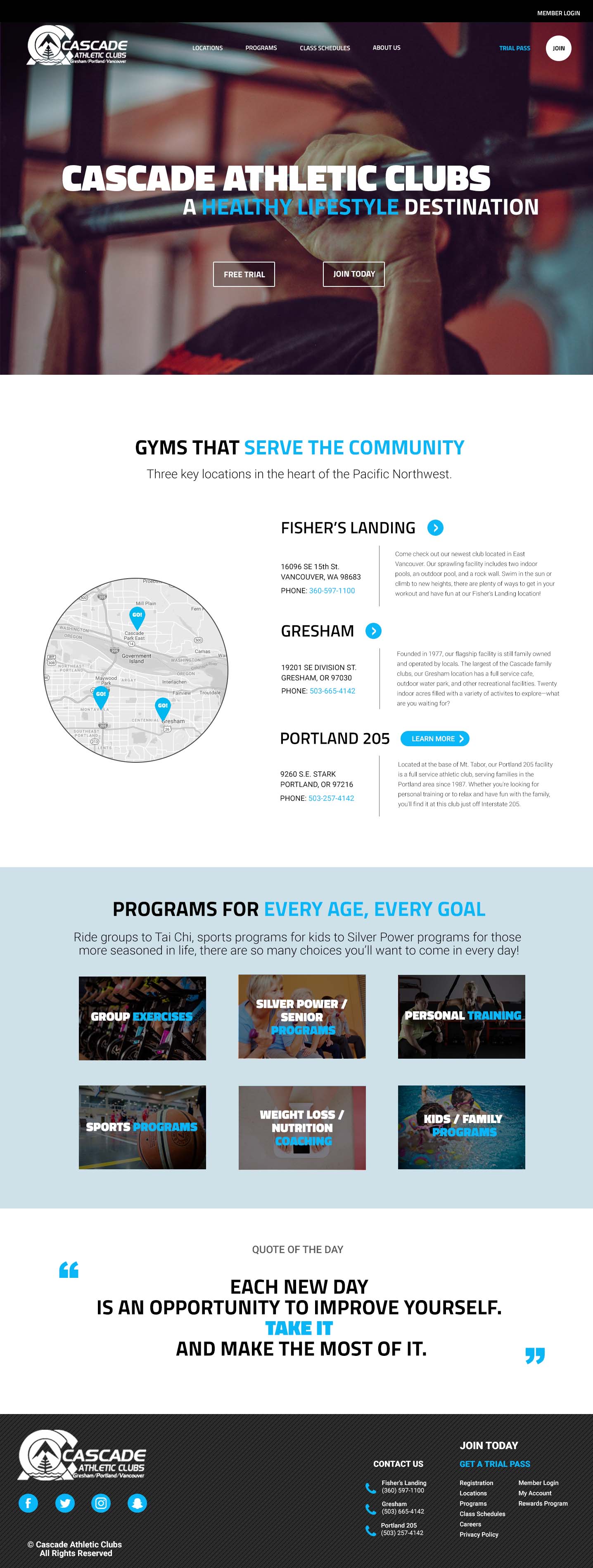
- The "Trial Pass" and "Join" CTAs are obvious, while the navigation is more minimalist and clean.
- The section on gym locations has key information, including:
- A map giving users a spatial orientation
- Key contact information for each gym, including an address and phone number.
- Blurb on the main amenities at each facility.
- An bold button that users know to click to learn more about individual gyms.
- There's a section showcasing offerings across gyms, including exercise classes and personal training.
- The quote of the day focuses on motivating members and potential members to achieve their goals at CAC.

Outcome
This project was my first hands-on challenge with user experience and ux writing.
What I’m sure were thoughtful considerations on part of the original CAC website designer were difficult to navigate for me as the user on the other end. Taking note of my needs and the difficulty in fulfilling them when using the site myself, along with a critical look into what similar organizations have highlighted on their sites, helped me create a design that I believe benefits a user akin to myself with my redesign.
Finally, I’ve found that I am interested in learning even more about UX/UI writing and design, and am sure this is just the first of many projects I hope to pursue in this area.
